
Summary
A solo end-to-end design project that transformed an error-prone, freeform color workflow into a structured, guided selection system — ensuring every firm's reports look polished without requiring any design expertise.
Platform
Black Diamond Wealth Solutions
The Problem
Firms were choosing colors — and the results showed it
SS&C Black Diamond lets advisory firms customize client-facing reports with their own colors. But the existing system relied on color pickers and hex codes, leaving firms—often without designers—to build palettes from scratch.
The result was a slow, confusing process that could produce inconsistent or clashing colors across charts, tables, and graphs.
The problem extended to the Classification Schema (CS) and Net Worth Schema (NWS), which used separate color sets with no safeguards to prevent conflicts across all three palettes.
Discovery
A UX audit revealed structural gaps beneath the surface complaint
Firm complaints about colors "not matching" turned out to be symptoms of deeper architectural problems. An audit of the existing system surfaced three root causes that no amount of better UI copy or picker improvements could fix.
The audit also identified that the underlying color system used two fundamentally different strategies — deterministic (fixed assignment per entity) and palette-based (dynamic pool assignment) — creating unpredictable results that even internal teams couldn't consistently explain.
Tools
Sketch, Claude, ChatGPT
Administrators complained the process was too manual. They didn’t know what colors went together and we solved that with a palette selector that automatically populated colors.
Design Process
The hardest part wasn't the workflow — it was the palettes themselves
The interaction model for a guided selection system was relatively straightforward to design. The real design challenge — and where most of the two months was spent — was determining what the actual color schemes should be.
Core Design Challenge
Each scheme had to satisfy several constraints simultaneously
Colors needed to be perceptually distinct at every level of the data hierarchy, harmonious when viewed together across an entire report, legible against light and dark backgrounds, and differentiated enough that two separate schemes didn't look interchangeable at a glance.
The 13 sequential groups — one hue family per level type, graduated from light to dark — had to be internally consistent while remaining visually distinct from one another. The 17 categorical colors for CS and NWS needed maximum perceptual distance between anchors so that Equities, Fixed Income, and Alternative Assets could never be confused in a pie chart. And all of this had to hold across four master palette variants.
There was no formula that solved it automatically. Each palette required iteration, visual validation across report components, and manual verification that CS and NWS anchors didn't conflict with the firm branding selection they'd be paired with.
The Solution
A 4-step guided workflow — each decision informs the next
The core mental model shift was from building to choosing. Instead of asking firms to construct a palette from scratch, the redesign presents curated, pre-harmonized schemes and lets firms select one. The expertise gap disappears because the expertise is built into the system.
Cohesion through constraint
The most consequential design decision was making palette selection interdependent. When a firm selects a bold, saturated scheme in step 2, incompatible palettes in steps 3 and 4 are disabled — not hidden, just visually indicated as unavailable. Firms can't accidentally create an incoherent report. Bad outcomes are structurally prevented, not just discouraged.
Key Design Decisions
Choosing over building
Giving firms a curated set of options rather than unlimited control was the most counterintuitive decision — and the most important one. More control would have reproduced the original problem. The accent color input provides just enough brand ownership without opening the door to mismatched choices.
Preview as a trust mechanism
The "Show example report" feature was non-negotiable. Abstract swatches don't convey how a palette behaves in a dense data table or a multi-series line graph. Firms needed to see the real output before committing — and seeing it in context made them significantly more confident in their selections.
30 colors, two strategies
The 30-color scheme wasn't an arbitrary number — it reflected how data actually appears in reports. Sequential colors (13 groups, one hue family each) give visual hierarchy within a category. Categorical anchors (17 colors) give immediate differentiation between distinct asset classes. The architecture matches the reporting logic it serves.
Outcome
A color system that scales across 1,000+ firms with no design expertise required
The guided color selection workflow is in active development. When shipped, firm administrators at any of SS&C Black Diamond's 1,000+ client firms will be able to complete their entire brand color setup through a structured, four-step process — with every reachable outcome being a valid, harmonious one.
The project also surfaced and addressed structural gaps in the underlying color architecture — establishing perceptual-distance guidelines for the colorizer and documenting the deterministic vs. palette-based color assignment distinction for future engineering work.
Role
Sole Product Designer
Duration
2 Months
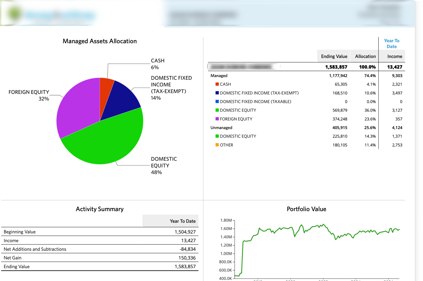
Colors that don’t pair well, create visually unappealing reports–which hurt our user experience.